
Refactor high-complexity React components in Dify frontend. Use when `pnpm analyze-component...

npx skills add matsonj/mviz
Or install specific skill: npx add-skill https://github.com/matsonj/mviz
A chart & report builder designed for use by AI.
name: mviz
description: A chart & report builder designed for use by AI.
mviz v1.4.7
Generate clean, data-focused charts and dashboards from compact JSON specs or markdown. Maximizes data-ink ratio with minimal chartjunk, gridlines, and decorative elements. Uses a 16-column grid layout system.
No installation required. Use npx -y -q mviz which auto-downloads from npm. The -q flag reduces npm output while still showing lint errors.
For faster repeated use, install globally: npm install -g mviz
Converts minimal JSON specifications into standalone HTML visualizations using ECharts. Instead of writing 50-100 lines of chart code, write a compact spec that gets expanded into a full HTML artifact with professional styling.
#f8f8f8 light) / Dark (#231f20 dark)echo '<json_spec>' | npx -y -q mviz > chart.html
npx -y -q mviz dashboard.md > dashboard.html
npx -y -q mviz my-dashboard/ > dashboard.html
Components are sized using size=[cols,rows] syntax:
```big_value size=[4,2]
{"value": 1250000, "label": "Revenue", "format": "usd0m"}
```
```bar size=[8,6]
{"title": "Sales", "x": "month", "y": "sales", "file": "data/sales.json"}
```
Height Guidelines:
| Row Units | Approximate Height | Good For |
|-----------|-------------------|----------|
| 2 | ~64px | KPIs, single-line notes |
| 4 | ~128px | Small tables, text blocks |
| 5-6 | ~160-192px | Standard charts |
| 8+ | ~256px+ | Dense tables, detailed charts |
For charts with many categories (10+ bars, 10+ rows in dumbbell), increase row units to prevent compression.
Critical: To place components side-by-side, their code blocks must have NO blank lines between them:
```bar size=[8,5]
{"title": "Chart A", ...}
```
```line size=[8,5]
{"title": "Chart B", ...}
```
This renders Chart A and Chart B on the same row. Adding a blank line between them would put them on separate rows.
| Syntax | Effect |
|---|---|
# H1 |
Major section title |
## H2 |
Section title |
### H3 |
Light inline header (subtle, smaller text) |
--- |
Visual divider line |
=== |
Page break for printing |
=== |
Explicit page break: forces new page in PDF |
empty_space |
Invisible grid cell spacer (default 4 cols × 2 rows) |
Heading Guidelines:
- Use # H1 for major document sections that warrant their own page when printed
- Use ## H2 for content sections within a page (most common)
- Use ### H3 for lightweight subheadings that don't interrupt flow
- In continuous: true mode, H1 page breaks are suppressed
Section vs Page Breaks:
- Use --- to separate logical sections visually. Content flows naturally to the next page when needed.
- Use === only when you explicitly want to force a new page (e.g., separating chapters or major report sections for PDF output).
- Never use === by default. Only add page breaks when the user specifically requests them.
| Component | Default Size | Notes |
|---|---|---|
big_value |
[4, 2] | Fits 4 per row |
delta |
[4, 2] | Fits 4 per row |
sparkline |
[4, 2] | Compact inline chart |
bar, line, area |
[8, 5] | Half width |
pie, scatter, bubble |
[8, 5] | Half width |
funnel, sankey, heatmap |
[8, 5] | Half width |
histogram, boxplot, waterfall |
[8, 5] | Half width |
combo |
[8, 5] | Half width |
dumbbell |
[12, 6] | 3/4 width |
table |
[16, 4] | Full width |
textarea |
[16, 4] | Full width |
calendar |
[16, 3] | Full width |
xmr |
[16, 6] | Full width, tall |
alert, note, text |
[16, 1] | Full width, single row |
empty_space |
[4, 2] | Invisible spacer |
| Layout Goal | Components | Sizes |
|---|---|---|
| 4 KPIs in a row | 4× big_value |
[4,2] each |
| 5 KPIs in a row | 4× big_value + 1 wider |
[3,2] + [4,2] |
| KPI + context | big_value + textarea |
[3,2] + [13,2] |
| KPI + chart | big_value + bar |
[4,2] + [12,5] |
```big_value size=[3,2]
{"value": 1250000, "label": "Revenue", "format": "usd0m"}
```
```big_value size=[3,2]
{"value": 8450, "label": "Orders", "format": "num0k"}
```
```big_value size=[3,2]
{"value": 2400000000, "label": "Queries", "format": "num0b"}
```
```delta size=[3,2]
{"value": 0.15, "label": "MoM", "format": "pct0"}
```
```delta size=[4,2]
{"value": 0.08, "label": "vs Target", "format": "pct0"}
```
This creates a row with 5 KPIs (3+3+3+3+4 = 16 columns).
```bar size=[8,6] file=data/region-sales.json
```
```line size=[8,6] file=data/monthly-trend.json
```
Charts: bar, line, area, pie, scatter, bubble, boxplot, histogram, waterfall, xmr, sankey, funnel, heatmap, calendar, sparkline, combo, dumbbell
UI Components: big_value, delta, alert, note, text, textarea, empty_space, table
Tables support column-level and cell-level formatting:
Column options: bold, italic, type ("sparkline" or "heatmap")
{
  "type": "table",
  "columns": [
    {"id": "product", "title": "Product", "bold": true},
    {"id": "category", "title": "Category", "italic": true},
    {"id": "sales", "title": "Sales", "fmt": "usd"},
    {"id": "margin", "title": "Margin", "type": "heatmap", "fmt": "pct"},
    {"id": "trend", "title": "Trend", "type": "sparkline", "sparkType": "line"}
  ],
  "data": [
    {"product": "Widget", "category": "Electronics", "sales": 125000, "margin": 0.85, "trend": [85, 92, 88, 95, 102, 125]}
  ]
}
Cell-level overrides: Use {"value": "text", "bold": true} to override column defaults.
Heatmap: Applies color gradient from low to high values. Text auto-switches to white on dark backgrounds.
Sparkline types: line, bar, area, pct_bar (progress bar), dumbbell (before/after comparison)
Notes support three severity levels via noteType:
| Type | Border Color | Use For |
|---|---|---|
default |
Red | Important notices (default) |
warning |
Yellow | Cautions, preliminary data |
tip |
Green | Best practices, pro tips |
Notes also support an optional label for bold prefix text:
{"type": "note", "label": "Pro Tip:", "content": "Use keyboard shortcuts for faster navigation.", "noteType": "tip"}
big_value - Hero metrics with large display:
{"type": "big_value", "value": 1250000, "label": "Revenue", "format": "usd0m"}
comparison object: {"value": 10300, "format": "usd", "label": "vs last month"} shows change with arrowdumbbell - Before/after comparisons with directional coloring:
{
  "type": "dumbbell",
  "title": "ELO Changes",
  "category": "team",
  "start": "before",
  "end": "after",
  "startLabel": "Week 1",
  "endLabel": "Week 2",
  "higherIsBetter": true,
  "data": [
    {"team": "Chiefs", "before": 1650, "after": 1720},
    {"team": "Bills", "before": 1600, "after": 1550}
  ]
}
higherIsBetter: false for rankings (lower = better)delta - Change metrics with directional coloring:
{"type": "delta", "value": 0.15, "label": "MoM Growth", "format": "pct0"}
comparison object: {"value": 0.05, "label": "vs Target"}area - Filled line chart for cumulative/volume data:
{
  "type": "area",
  "title": "Daily Active Users",
  "x": "date",
  "y": "users",
  "data": [{"date": "Mon", "users": 1200}, {"date": "Tue", "users": 1450}]
}
combo - Bar + line with dual Y-axis:
{
  "type": "combo",
  "title": "Revenue vs Growth Rate",
  "x": "quarter",
  "y": ["revenue", "growth_rate"],
  "data": [
    {"quarter": "Q1", "revenue": 1000000, "growth_rate": 0.15},
    {"quarter": "Q2", "revenue": 1200000, "growth_rate": 0.20}
  ]
}
heatmap - 2D matrix visualization:
{
  "type": "heatmap",
  "title": "Activity by Hour",
  "xCategories": ["Mon", "Tue", "Wed", "Thu", "Fri"],
  "yCategories": ["9am", "12pm", "3pm", "6pm"],
  "format": "num0",
  "data": [[0, 0, 85], [1, 0, 90], [2, 0, 72]]
}
format option applies to cell labels (e.g., num0k, usd0k, pct)funnel - Conversion or elimination flows:
{
  "type": "funnel",
  "title": "Sales Pipeline",
  "format": "num0",
  "data": [
    {"stage": "Leads", "value": 1000},
    {"stage": "Qualified", "value": 600},
    {"stage": "Proposal", "value": 300},
    {"stage": "Closed", "value": 100}
  ]
}
format option applies to labels/tooltips (e.g., usd_auto, pct, num0)waterfall - Cumulative change visualization:
{
  "type": "waterfall",
  "title": "Revenue Bridge",
  "x": "item",
  "y": "value",
  "data": [
    {"item": "Start", "value": 1000, "isTotal": true},
    {"item": "Growth", "value": 200},
    {"item": "Churn", "value": -50},
    {"item": "End", "value": 1150, "isTotal": true}
  ]
}
bubble - Scatter plot with size dimension:
{
  "type": "bubble",
  "title": "Market Analysis",
  "x": "growth",
  "y": "profit",
  "size": "revenue",
  "data": [
    {"growth": 5, "profit": 20, "revenue": 100},
    {"growth": 10, "profit": 15, "revenue": 200}
  ]
}
sankey - Flow diagrams showing relationships:
{
  "type": "sankey",
  "title": "Traffic Sources",
  "data": [
    {"source": "Organic", "target": "Landing", "value": 500},
    {"source": "Paid", "target": "Landing", "value": 300},
    {"source": "Landing", "target": "Signup", "value": 400}
  ]
}
| Format | Example | Use For |
|---|---|---|
auto |
1.000m, 10.00k | Smart auto-format (recommended) |
usd_auto |
$1.000m, $10.00k | Smart auto-format with $ prefix |
usd0m |
$1.2m | Millions |
usd0b |
$1.2b | Billions |
usd0k |
$125k | Thousands |
usd |
$1,250,000 | Detailed amounts |
num0m |
1.2m | Millions |
num0b |
1.2b | Billions |
num0k |
125k | Thousands |
num0 |
1,250,000 | Detailed counts |
pct |
15.0% | Percentage with decimal |
pct0 |
15% | Percentage integer |
pct1 |
15.0% | Percentage with 1 decimal |
Important: Percentage formats expect decimal values (0.25 = 25%), not whole numbers.
Smart formatting (auto/usd_auto) is recommended. The format option applies to both axis labels and data labels on bar charts. It automatically picks the right suffix (k, m, b) based on magnitude and always shows 4 significant digits. Negative values are wrapped in parentheses: (1.000m).
When no format is specified, smart formatting is used by default.
Chart axes automatically detect the appropriate format based on field names:
| Field Pattern | Auto Format | Example |
|---|---|---|
| revenue, sales, price, cost, profit, amount | usd_auto |
$1.250m |
| pct, percent, rate, ratio | pct |
15.0% |
| All other numeric fields | auto |
1.250m |
Override with an explicit format field in the chart spec.
The chart generator auto-detects columnar query results. Instead of manually converting columns/rows to data, pass the result directly:
{
  "type": "bar",
  "title": "Sales by Region",
  "x": "region",
  "y": "sales",
  "columns": ["region", "sales"],
  "rows": [["North", 45000], ["South", 32000], ["East", 28000]]
}
This is automatically converted internally. No manual JSON reconstruction needed.
For line, area, bar, and combo charts, control y-axis range with yMin and yMax:
{
  "type": "line",
  "title": "Elo Rating Trend",
  "x": "date",
  "y": "elo",
  "yMin": 1400,
  "data": [{"date": "Oct", "elo": 1511}, {"date": "Jan", "elo": 1636}]
}
Use yMin when:
- Data doesn't start at 0 (ratings, stock prices, temperatures)
- You want to emphasize relative changes over absolute values
Use yMax when:
- Labels are being cut off at the top of the chart
- You need headroom above the highest data point
The CLI validates specs automatically using built-in lint rules. Use --lint flag for validation-only mode:
npx -y -q mviz --lint dashboard.md # Validate without generating HTML
| Rule | Severity | Trigger |
|---|---|---|
required-fields |
warning | Missing required fields like x, y, or data |
unknown-field |
warning | Field not recognized for the chart type |
time-series-sorted |
error | Time series data not in chronological order |
sankey-wrong-keys |
error | Using from/to instead of source/target |
big-value-string |
error | Passing "62.5%" string instead of 0.625 number |
duplicate-x-values |
warning | Duplicate values on x-axis |
Errors exit with code 1. Warnings log to stderr but don't fail.
Time series error: Sort your data by date before passing to the chart.
Sankey wrong keys: Use source, target, value in your data:
{"source": "A", "target": "B", "value": 100}
big_value string: Pass numeric value with format option:
{"type": "big_value", "value": 0.625, "format": "pct0", "label": "Rate"}
The generator outputs helpful warnings to stderr when issues are detected:
| Warning | Cause | Solution |
|---|---|---|
Invalid JSON in 'bar' block |
Malformed JSON syntax | Check JSON syntax, ensure proper quoting |
Unknown component type 'bars' |
Typo in chart type | Use suggested type (e.g., bar not bars) |
Cannot resolve 'file=...' |
File reference without base directory | Use file path argument or inline JSON |
Row exceeds 16 columns |
Too many components in one row | Reduce component widths or split into rows |
Warnings include context like content previews, similar type suggestions, and section/row info.
If data labels on bar, line, or area charts are being cut off at the top:
yMax to ~10-15% higher than that valueExample: If max value is 200, set "yMax": 220
{
  "type": "bar",
  "title": "Sales",
  "x": "month",
  "y": "sales",
  "yMax": 250,
  "data": [{"month": "Jan", "sales": 180}, {"month": "Feb", "sales": 220}]
}
This provides headroom for the label text above the bars.
Use SQL to generate data files instead of manually authoring JSON. This reduces errors and ensures data accuracy:
-- Generate chart data file
COPY (
  SELECT month, SUM(sales) as sales, SUM(revenue) as revenue
  FROM orders
  GROUP BY month
  ORDER BY month
) TO 'data/monthly-sales.json' (FORMAT JSON, ARRAY true);
Then reference the generated file:
```bar file=data/monthly-sales.json
{"title": "Monthly Sales", "x": "month", "y": "sales"}
```
This approach:
- Ensures data accuracy (no manual transcription errors)
- Keeps data in sync with source systems
- Reduces token usage (SQL is more compact than JSON arrays)
- Makes updates easy (re-run query to refresh)
Reference external data files to save tokens and enable data/visualization separation:
```bar size=[8,6] file=data/sales.json
```
CSV files work great with DuckDB for data exploration:
# Export query results to CSV
duckdb -csv -c "SELECT quarter, revenue FROM sales" > data/quarterly.csv
```bar file=data/quarterly.csv
{"title": "Quarterly Revenue", "x": "quarter", "y": "revenue"}
```
| Approach | Best For |
|---|---|
| Inline JSON | Small, static specs |
| JSON files | Reusable chart configs |
| CSV files | DuckDB workflows, frequently updated data |
---
theme: light
title: My Dashboard
---

# Page Title

## Section Name

```big_value size=[4,2]
{"value": 125000, "label": "Revenue", "format": "usd0k"}
```
```bar size=[12,6] file=data/sales.json
```
Rules:
- # Title sets the page title (first occurrence only)
- ## Section creates a new section with divider (border, spacing)
- ### Header creates a soft header within the current section (no divider)
- --- creates a section break (untitled, visual divider only)
- === creates a page break (forces new page when printing to PDF)
- size=[cols,rows] controls layout (16-column grid)
- size=auto auto-calculates size from data
- file=path references external JSON
- Empty lines = new rows
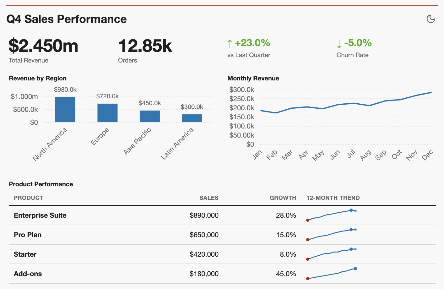
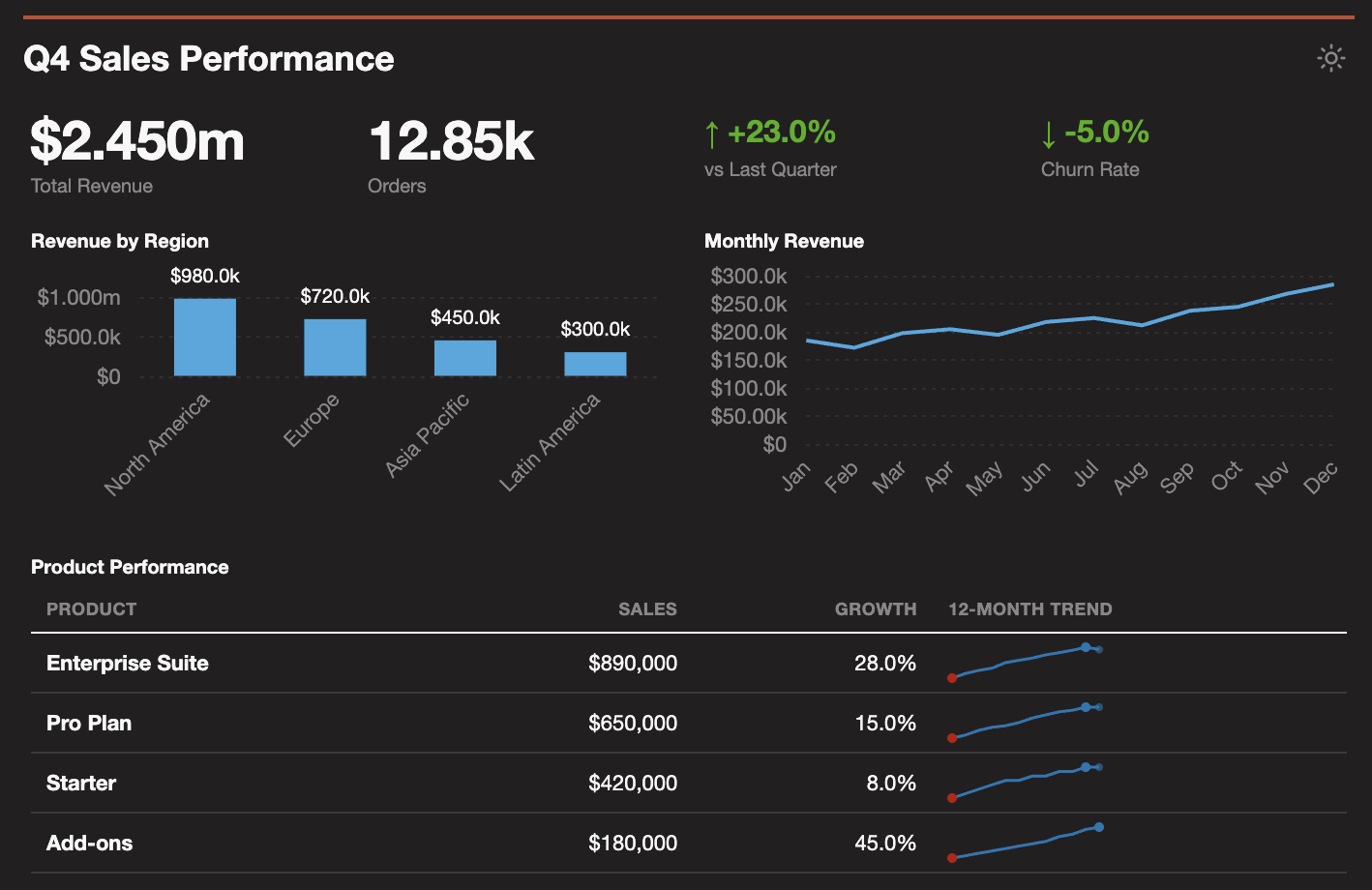
Dashboards include a theme toggle button (top right) that switches between light and dark modes. All charts dynamically update when the theme changes.
Set the default theme in frontmatter:
---
title: My Dashboard
theme: dark
continuous: true
---
| Option | Description |
|---|---|
title |
Dashboard title displayed at top |
theme |
light (default) or dark |
continuous |
When true, removes section breaks between # headers for flowing layout |
The theme toggle affects all charts globally - individual chart theme settings are ignored in favor of the global toggle.
Load custom brand colors and fonts from a YAML file:
npx -y -q mviz --theme my_theme.yaml dashboard.md > dashboard.html
Example theme file:
name: brand-colors
extends: light

colors:
  primary: "#1a73e8"
  secondary: "#ea4335"

palette:
  - "#1a73e8"
  - "#ea4335"
  - "#fbbc04"

fonts:
  family: "'Roboto', sans-serif"
  import: "https://fonts.googleapis.com/css2?family=Roboto&display=swap"
Custom themes merge with defaults - only specify what you want to override.
Charts are optimized for printing to PDF:
When printing dashboards to PDF, all content stays intact without being cut off mid-chart.
Use formatted (multi-line) JSON when data may need editing. This enables smaller, more precise edits:
```bar size=[8,5]
{
  "title": "Monthly Sales",
  "x": "month",
  "y": "sales",
  "data": [
    {"month": "Jan", "sales": 120},
    {"month": "Feb", "sales": 150},
    {"month": "Mar", "sales": 180}
  ]
}
```
Benefits:
- Each data point on its own line enables targeted edits
- Changing one value: ~30 chars vs ~200+ chars with compact JSON
- Easier to review diffs in version control
When to use compact JSON:
- Very small specs (< 100 chars)
- Data that won't change
- Single-line values like {"value": 1250000, "label": "Revenue"}
mviz specs can be validated using the JSON Schema at:
https://raw.githubusercontent.com/matsonj/mviz/main/schema/mviz.schema.json
Add $schema to enable editor autocomplete and validation:
{
  "$schema": "https://raw.githubusercontent.com/matsonj/mviz/main/schema/mviz.schema.json",
  "type": "bar",
  "title": "Sales",
  ...
}
| Color | Hex | Use |
|---|---|---|
| Primary Blue | #0777b3 |
Primary series |
| Secondary Orange | #bd4e35 |
Secondary series, accent |
| Info Blue | #638CAD |
Tertiary, informational |
| Positive Green | #2d7a00 |
Success, positive values |
| Warning Amber | #e18727 |
Warnings |
| Error Red | #bc1200 |
Errors, negative emphasis |
See reference/chart-types.md for complete documentation.
You are an analytics assistant helping a human who has decision-making context that you lack. Your job is to present data clearly and surface patterns worth investigating—not to draw conclusions or make recommendations.
Key principles:
- Use a matter-of-fact tone. State what the data shows, not what it means.
- Design analysis that invites further questions, not analysis that closes them.
- Surface anomalies and patterns without assuming their cause or significance.
- Let the human add context and make decisions.
For additional guidance on creating effective data visualizations—including Tufte-inspired principles, anti-patterns to avoid, and layout examples—see Best_practices.md.
Having issues with mviz? Ask Claude to create a friction log documenting the problem, then open it as an issue at https://github.com/matsonj/mviz/issues
Generate beautiful static reports for ad hoc analysis. A Claude skill that turns compact JSON specs into professional HTML visualizations.
The highest-value analysis in any company is point-in-time, highly contextual, and not reused once the decision is made.
Traditional BI tools optimize for reusability instead of usefulness. Useful analysis, the kind that drives critical decisions, needs something more:
Instead of writing 50-100 lines of chart boilerplate, write a compact JSON spec that gets expanded into a full HTML artifact with ECharts.
Connect Claude to your data using an MCP server:
.duckdb files, Parquet, CSV, or S3 dataIf you do not have a database available, you can also load CSV files directly, although the amount of data you can fit in context can be quite limiting.
Claude Web or Desktop: Download mviz.skill and add it to your project knowledge.
Claude Code: Run npx add-skill matsonj/mviz or clone this repo and work from the directory.
The best analysis follows four steps:
Start by exploring your data with natural questions. Claude writes SQL queries behind the scenes and brings the results into context:
"Show me revenue by region for Q4"
"What are our top 10 customers by lifetime value?"
"Are there any anomalies in last month's sales data?"
Once you've built up context and are ready to visualize, tell Claude to "use mviz to report on this analysis". Claude generates a polished HTML report from the data you've explored.
Refine your analysis by asking follow-up questions:
"Change that bar chart to a line chart"
"Drill into the APAC region—what's driving that spike?"
"Add a table showing the top 5 products by growth rate"
mviz uses a 16-column grid.
"Make the bar chart wider"
"Show two charts side by side at size=[8,6] each"
"Make the KPIs smaller: size=[3,2] so 5 fit in a row"
By default, it will use size=auto to let mviz calculate appropriate dimensions based on your data.
[!TIP]
There are more chart types available in the library than are included in the skill.md. You can tell Claude to look at the TypeScript source for more chart types if you really need them.
Each iteration builds on your existing context. When you're done, save the HTML or print to PDF.
| Type | Description | mviz.skill |
|---|---|---|
bar |
Vertical/horizontal, grouped, stacked | ✓ |
line |
Single or multi-series with linear interpolation | ✓ |
area |
Simple or stacked area charts | |
pie |
Pie or donut charts | |
scatter |
2D scatter plots | ✓ |
bubble |
Scatter with size dimension (auto-detects categorical axes) | |
boxplot |
Statistical box plots | |
histogram |
Distribution visualization | |
sankey |
Flow diagrams | |
funnel |
Conversion funnels | |
heatmap |
2D color matrices | |
calendar |
GitHub-style calendar heatmaps | |
sparkline |
Compact inline charts | |
combo |
Combined bar + line with dual axes | |
waterfall |
Cumulative effect charts | |
xmr |
Statistical control charts (supports yMin/yMax) |
|
dumbbell |
Before/after comparisons with directional color-coding |
| Type | Description | mviz.skill |
|---|---|---|
big_value |
Large KPI metric display | |
delta |
Change indicator with arrow | |
table |
Data tables with formatting and inline sparklines | ✓ |
alert |
Colored notification banners | |
note |
Information callout boxes | ✓ |
text |
Styled paragraphs | |
textarea |
Markdown-rendered text blocks | ✓ |
empty_space |
Layout spacing component | ✓ |
Reference external files instead of embedding large JSON specs:
```bar file=data/monthly-sales.json
```
CSV files work great for data exploration with DuckDB:
# Export query results
duckdb -csv -c "SELECT month, revenue FROM sales GROUP BY 1" > data/monthly.csv
```bar file=data/monthly.csv
{"title": "Monthly Revenue", "x": "month", "y": "revenue"}
```
CSV provides data, inline JSON provides chart options. Auto-detects x/y from first two columns if no options given.
---
theme: light
title: My Report
---

# Page Title

## Section Name

```big_value size=[4,2]
{"value": 125000, "label": "Revenue", "format": "usd0m"}
```
```delta size=[4,2]
{"value": 0.15, "label": "vs Last Month", "format": "pct0"}
```

```bar size=[8,6] file=data/sales.json
```
```line size=[8,6] file=data/trend.json
```
# Title creates a new section (first one also sets page title)## Section creates a subsection title (no visual divider)--- creates a visual section divider=== creates a page break for printingsize=[cols,rows] controls 16-column grid layoutsize=auto auto-calculates size based on datafile=path references external JSON| Component | Default Size | Notes |
|---|---|---|
big_value, delta, sparkline |
[4, 2] | Fits 4 per row |
bar, line, area, pie |
[8, 5] | Half width |
scatter, bubble, combo, funnel |
[8, 5] | Half width |
dumbbell |
[12, 6] | 3/4 width for comparisons |
table, heatmap |
[16, 4-10] | Full width |
xmr, calendar |
[16, 6] | Full width, tall |
Tables support inline sparkline columns for trend visualization:
{
  "type": "table",
  "columns": [
    {"id": "product", "title": "Product"},
    {"id": "sales", "title": "Sales", "fmt": "usd"},
    {"id": "trend", "title": "Trend", "type": "sparkline", "sparkType": "line"},
    {"id": "progress", "title": "Goal", "type": "sparkline", "sparkType": "pct_bar", "width": 100}
  ],
  "data": [
    {"product": "Widget", "sales": 125000, "trend": [85, 92, 88, 95, 102, 110, 125], "progress": 0.85}
  ]
}
Sparkline types: line, bar, area, pct_bar (progress bar), dumbbell (before/after)
| Format | Output | Description |
|---|---|---|
auto |
1.000m, 10.00k | Smart auto-format (default) |
usd_auto |
$1.000m, $10.00k | Smart auto-format with $ |
usd0m |
$1.2m | Millions |
usd0k |
$125k | Compact thousands |
usd |
$1,250,000 | Full dollars |
pct0 |
15% | Percentage integer |
pct |
15.0% | Percentage with decimal |
pct1 |
15.0% | Percentage with 1 decimal |
num0 |
1,250 | Number with commas |
Smart formatting automatically picks the right suffix (k, m, b) based on magnitude and shows 4 significant digits. Negative values display in parentheses: (1.000m).
Chart axes automatically detect the appropriate format based on field names:
| Field Pattern | Auto Format | Example |
|---|---|---|
| revenue, sales, price, cost, profit | usd_auto |
$1.250m |
| pct, percent, rate, ratio | pct or pct0 |
15.0% |
| All other fields | auto |
1.250m |
Override with an explicit format field in the chart spec.
Reports include a theme toggle button (top right) that switches between light and dark modes. All charts dynamically update when the theme changes.
Set the default theme in frontmatter:
---
theme: dark
title: My Report
---
Charts are optimized for printing to PDF:
When printing reports to PDF, all content stays intact without visual elements being cut off.
Clean, data-focused styling:
#f8f8f8) for light, dark (#231f20) for dark| Color | Hex | Use |
|---|---|---|
| Primary Blue | #0777b3 |
Primary series |
| Secondary Orange | #bd4e35 |
Secondary series, accent |
| Info Blue | #638CAD |
Tertiary |
| Positive Green | #2d7a00 |
Success, positive values |
| Warning Amber | #e18727 |
Warnings |
| Error Red | #bc1200 |
Errors, negative emphasis |
chart-skill/
├── ts-src/                  # TypeScript implementation
│   ├── cli.ts              # CLI entry point
│   ├── index.ts            # Library exports
│   ├── types.ts            # TypeScript type definitions
│   ├── core/               # Shared utilities
│   │   ├── themes.ts       # Colors, palettes, theme config
│   │   ├── formatting.ts   # Number formatting
│   │   └── css.ts          # CSS generation
│   ├── charts/             # 17 chart type modules
│   │   ├── bar.ts, line.ts, area.ts, pie.ts, scatter.ts, bubble.ts
│   │   ├── boxplot.ts, histogram.ts, waterfall.ts, xmr.ts
│   │   ├── sankey.ts, funnel.ts, heatmap.ts, calendar.ts
│   │   └── sparkline.ts, combo.ts, dumbbell.ts
│   ├── components/         # 8 UI component modules
│   │   ├── big_value.ts, delta.ts, alert.ts, note.ts
│   │   ├── text.ts, textarea.ts, empty_space.ts, table.ts
│   └── layout/             # Report parser
│       ├── parser.ts       # Markdown layout parsing
│       └── templates.ts    # HTML templates
├── build_skill.py           # Builds .skill package for distribution
├── tests/
│   ├── harness/            # Visual test harness markdown
│   ├── dashboard-inline/    # Test dashboard with inline JSON
│   └── dashboard-with-refs/ # Test dashboard with file references
├── docs/
│   ├── MD-CHARTS-PROJECT.md # Original project specification
│   └── agents.md            # Skill authoring reference
└── skill-bundle/            # Source files for the skill
    ├── SKILL.md             # Skill instructions (with YAML frontmatter)
    ├── reference/
    │   └── chart-types.md   # Complete API reference
    └── examples/            # JSON and markdown examples
The chart generator outputs helpful warnings to stderr when issues are detected:
| Warning | Cause | Solution |
|---|---|---|
Invalid JSON in 'bar' block |
Malformed JSON syntax | Check JSON syntax, ensure proper quoting |
Unknown component type 'bars' |
Typo in chart type | Use suggested type (e.g., bar not bars) |
Cannot resolve 'file=...' |
File reference without base directory | Use file path argument or inline JSON |
Row exceeds 16 columns |
Too many components in one row | Reduce component widths or split into rows |
Invalid value for 'value' in big_value |
Wrong data type (e.g., string instead of number) | Ensure values match expected types |
Warnings include context like content previews, suggestions for similar types, and section/row information to help locate issues.
npx mviz dashboard.md > output.html     # Generate HTML
npx mviz --lint dashboard.md            # Validate only (no output)
npx mviz -l spec.json                   # Short form of --lint
The --lint flag validates your spec without generating HTML output. Useful for CI/CD pipelines or quick validation.
cd ts-src
npm test                    # TypeScript tests (vitest)
npm run build               # Build TypeScript
npm run typecheck           # Type checking only
The skill bundle (skill-bundle-compact/) is optimized for Claude for Web with minimal token usage (~750 tokens). Supports essential types:
- Charts: bar, line, scatter
- Components: table (with sparklines), note, textarea, empty_space
For additional chart types (pie, area, heatmap, sankey, etc.), Claude can reference the TypeScript source code in this repository. See Best_practices.md for layout guidance and visualization principles.
The skill is automatically available when working in this project directory.
.skill file or all files from skill-bundle/ to the project knowledge baseData visualization best practices:
- Maximize data-ink ratio (minimal non-data elements)
- Tight, dense layouts for reports
- No gratuitous animations or visual clutter
- Clean, minimal axes (no domain lines, subtle grid)
- Linear interpolation for accurate data representation
- Focus on data clarity over decoration
MIT
Refactor high-complexity React components in Dify frontend. Use when `pnpm analyze-component...
Trigger when the user requests a review of frontend files (e.g., `.tsx`, `.ts`, `.js`). Support...
Generate Vitest + React Testing Library tests for Dify frontend components, hooks, and...
Guide for implementing oRPC contract-first API patterns in Dify frontend. Triggers when creating...
This skill is compatible with the SKILL.md standard and works with all major AI coding agents:
Learn more about the SKILL.md standard and how to use these skills with your preferred AI coding agent.